
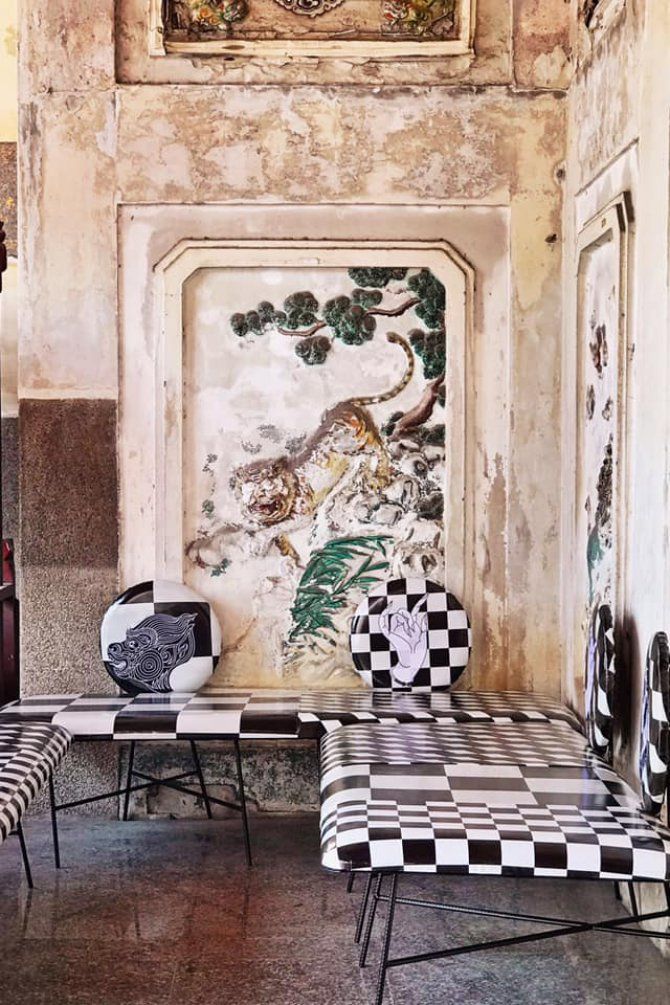
“Don’t be afraid to use all the colours in the crayon box” – RuPaul
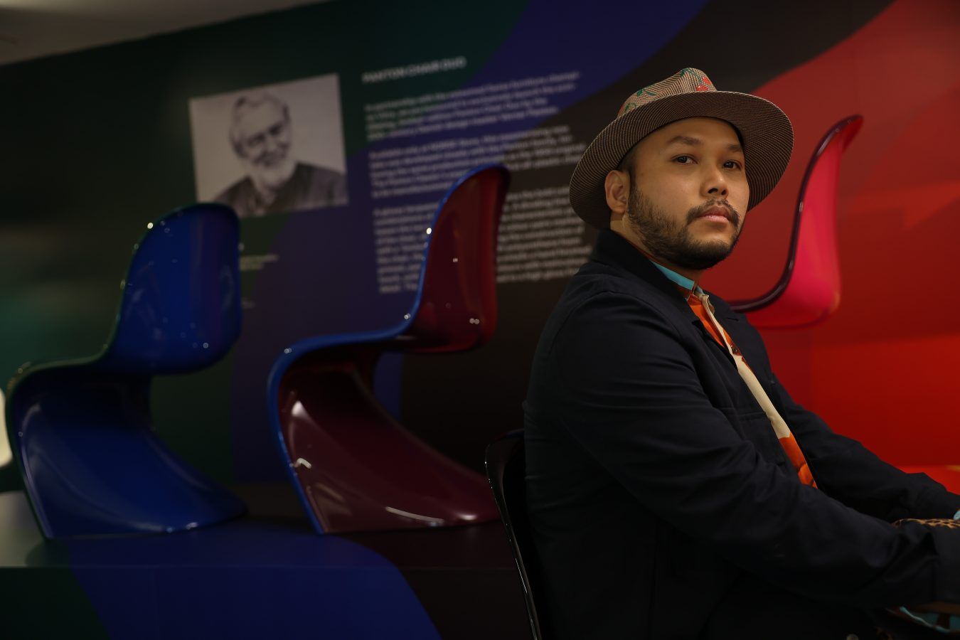
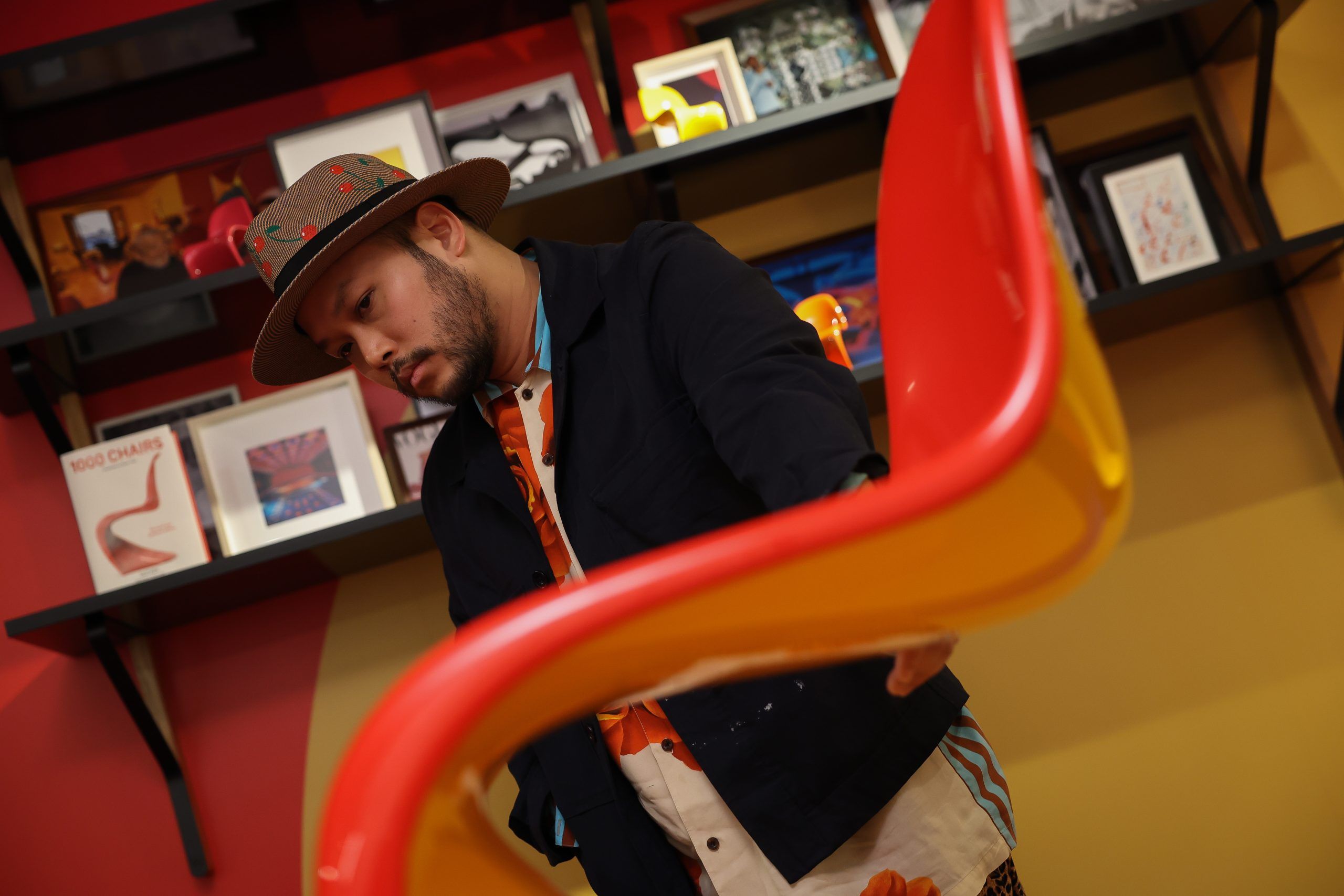
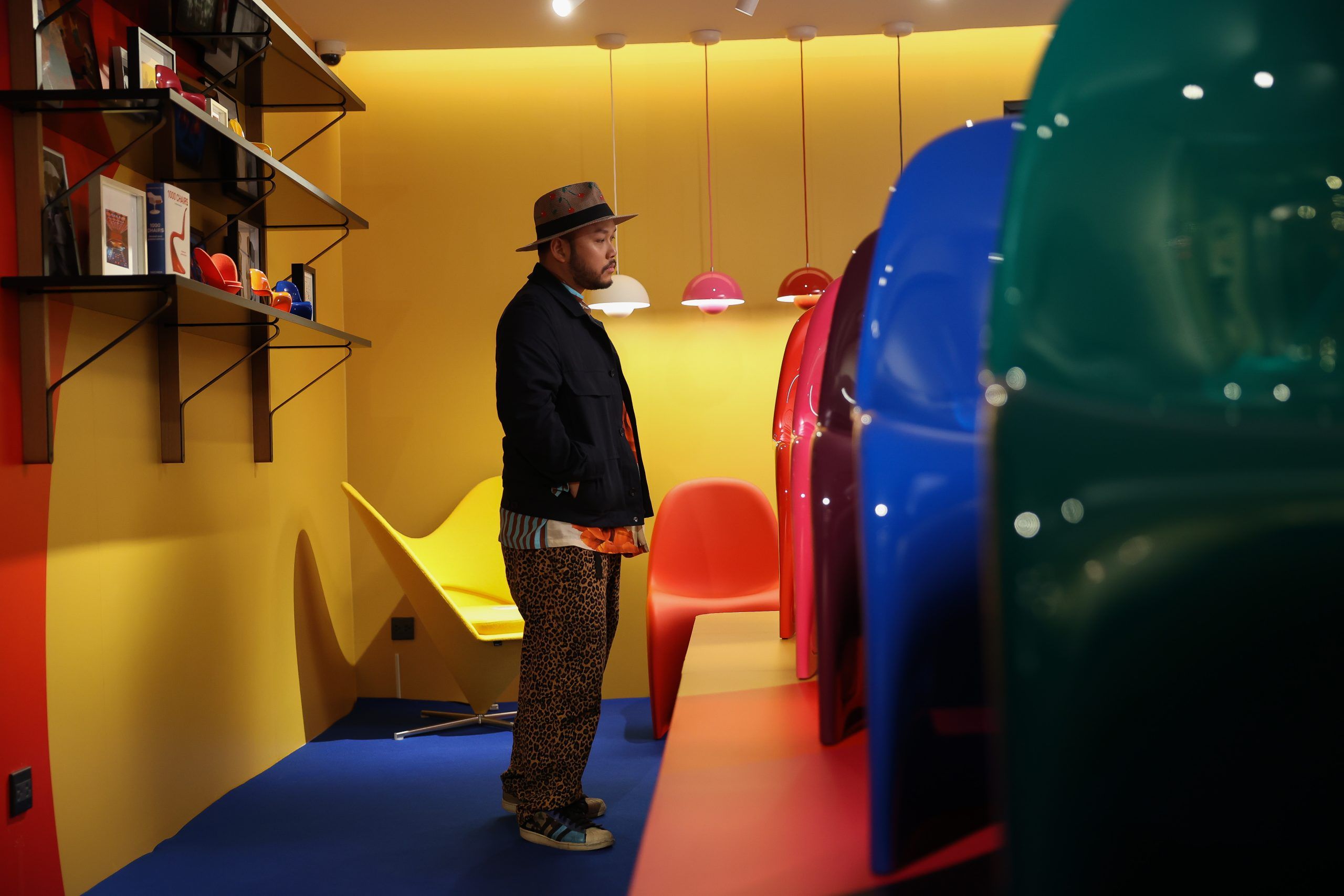
The essence of colour represents a meaning to life as colours provoke different emotions. All design works rely on colour due to its use and significance in creating balance and consistency. With that, many designers see the importance of colour, including Saran Yen Paya, whom we talked to at the NORSE Republics Panton Chair Duo exhibition.
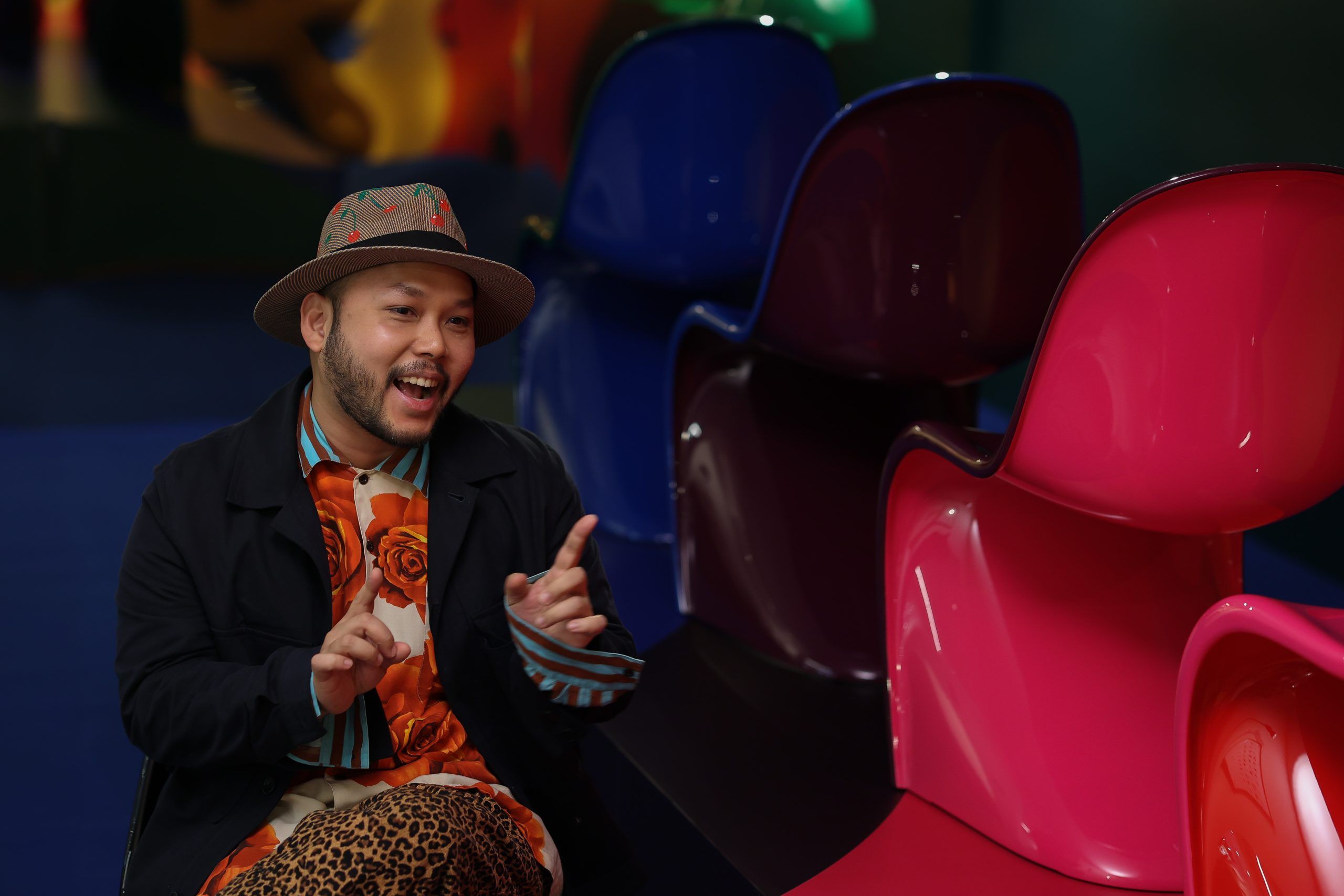
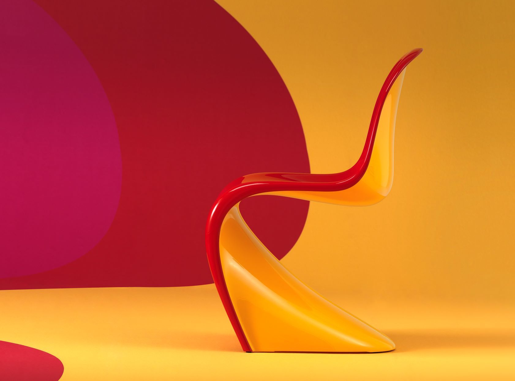
Designed by Verner Panton, the iconic Panton Chair was made possible due to the manufacturing company Vitra. Vitra has also produced the Panton Chair Duo, contrasting two shades to honour Verner Panton’s creativity. As NORSE Republics becomes Vitra’s official Thailand distributor of the limited edition chair, the store has ensembled an art installation. Designers of all fields were invited to view Panton’s iconic pieces and talk about colour. Let’s see what guest Saran Yen Paya has to say.
Who is Saran Yen Paya?
Saran is the Creative Director of 56thstudio, a creative agency focusing on storytelling. More than just the end product, the firm is all about the whole process. From brand concept development, storytelling strategy, content making, and more, 56thstudio does it all, even turning something ‘bad’ into good. To explain, the identity of his work is to “make people see the good in bad things. Things people perceive as old, cheap, or lame, I take as a challenge to create something new.”
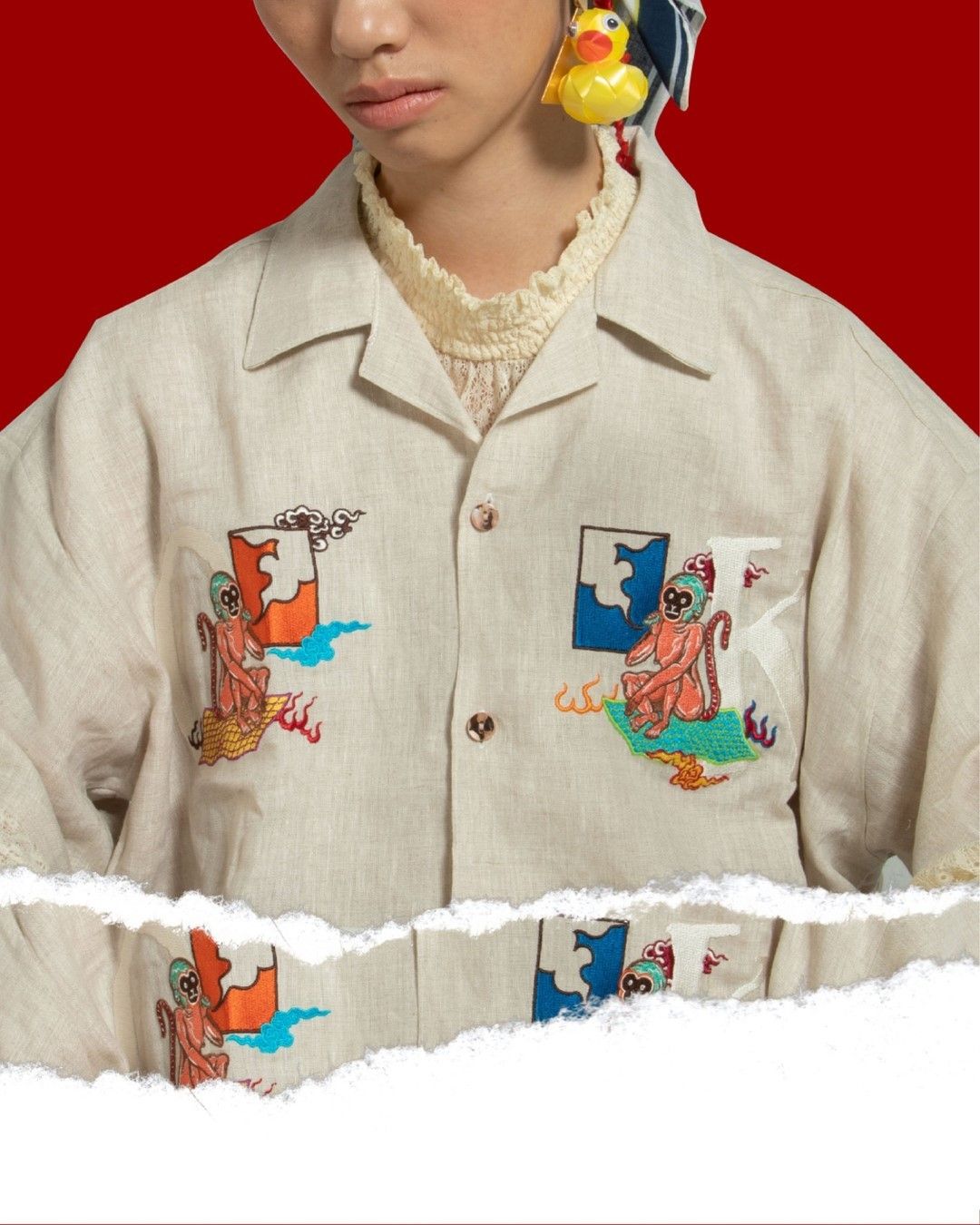
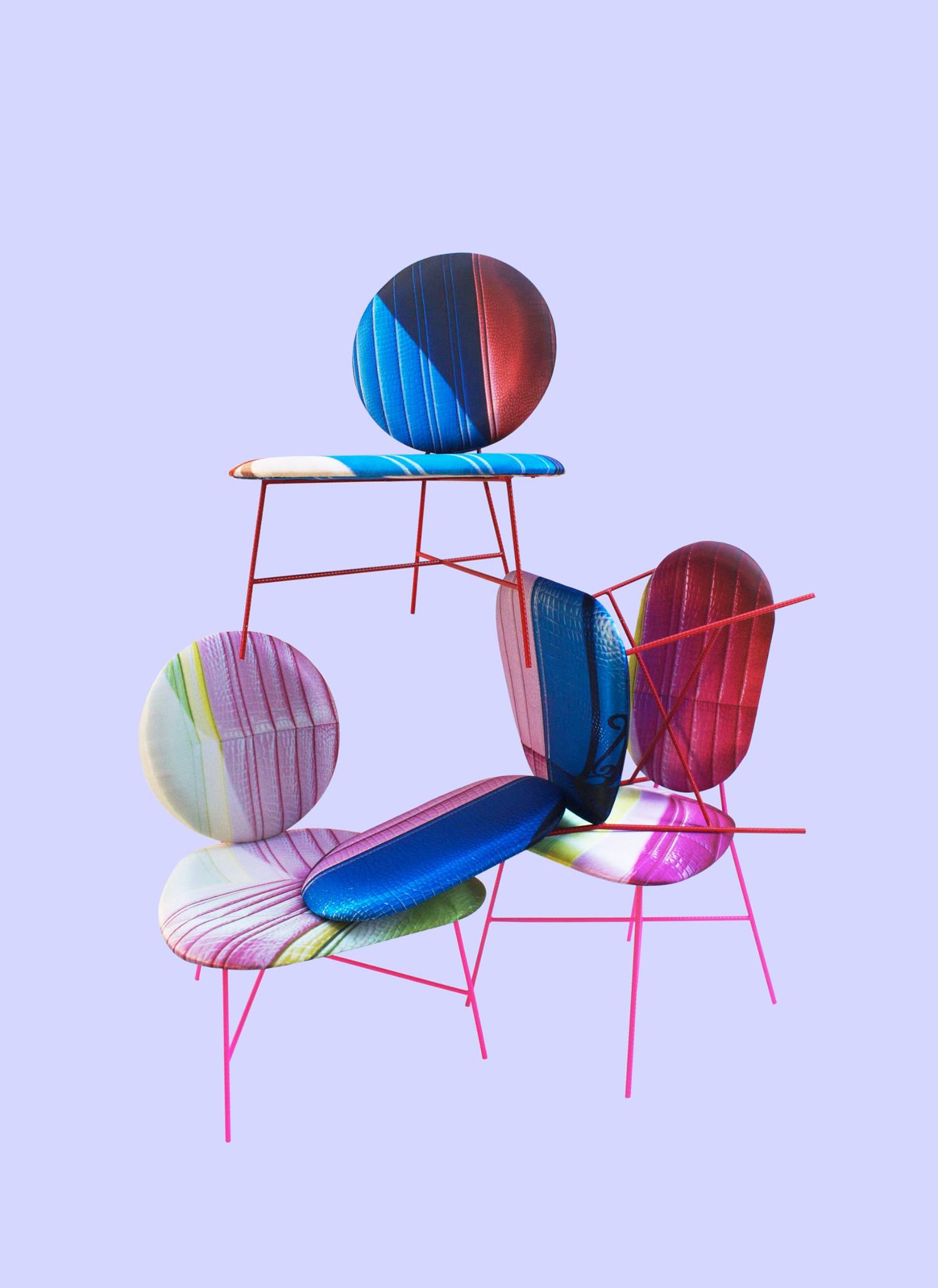
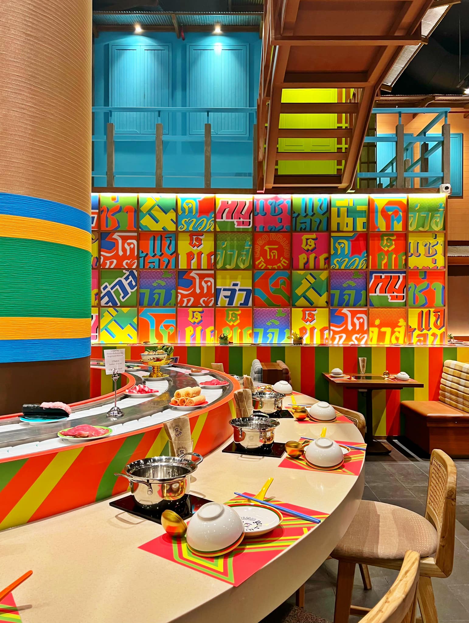
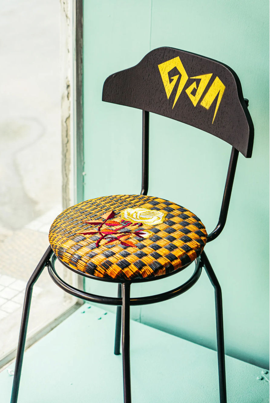
Some of Saran’s work:
As 56studio has been running for twelve to thirteen years, Saran puts a lot of emphasis on synergy. The energy brought to the table during meetings or daily conversations contributes to the results. With that, his focal point of work is communication. “It’s all about communication; it helps me understand my clients even more, said Saran.” Saran always wants the best for his customers to the point he is willing to lose them. “If our mindset regarding a project differs too much, I would recommend them to someone else.”
Using colours and don’t be afraid
“Colour is super important. When my clients want to use more colours, it’s music to my ears.” Saran later quoted from RuPaul, “don’t be afraid to use all the colours in the crayon box.” The creative director has a firm belief that we should avoid being scared. His advice to the newer generation was “to be a fool” by trying new things, as taking risks opens the path that leads to identity construction.
With that thought, Saran loves to use colours, especially being Thai, as various Thai artworks use a diversity of tones. He tells us that yellow is his favourite colour to work with because it goes with everything. Also, according to psychology, yellow uplifts the spirit and makes you feel fresh (who doesn’t love that?) The talented designer also dives deeper into the colour, saying that yellow accepts itself and transforms into different shades when mixed with other coloured. Similar to him, Saran evolves every time he encounters different experiences.
The King & his chair
Being a fan of Verner Panton, Saran declared that the 60s and 70s wouldn’t be that era if the Danish designer wasn’t there. Saran takes inspiration from the King’s designs as they are chic, modern, and timeless— the Panton Chair being a prime example. The fact that this chair is still seen as contemporary in the 21 century even though it was from the 60s shows how it “stands the test of time.” The artwork’s endurance was further emphasised as Vitra produced the Panton Chair Duo. “Oh my god, the yellow and red. That’s my favourite.”
Saran tells us a lesson we can all take from the Panton Chair is “to have courage.” Although he cannot compete with the King regarding furniture, Saran said if he were to take inspiration from Verner Panton to produce mor lam. ‘Mor lam’ is a traditional Lao song that reminds him of the aesthetics, vibrance, and fun of the 60s and 70s. Never heard of it? It’s time to go on YouTube to find out.
Tags


Written by
Drinking is best during the day, especially when at brunch. If she's not working, catch her at the gym or socializing with friends. An introvert extrovert at heart. She's a Capricorn.